Okell’s Case Study
Okell’s (Falcon Collection)
Selected to be featured in The Best Beverage Packaging Designs by DesignRush.
Brief
Okell’s Brewery approached Ashgrove Marketing to develop a strategic brand positioning and a packaging design direction for a new range of products in cans instead of bottles. The multi-award-winning Okell’s Brewery was founded in 1850 and their beers are brewed according to the strict Manx Purity Act. Their ambition is to expand their reach beyond the Isle of Man to the UK, EU and US markets. That meant the brand and packaging design had to reflect not only international standards, but also appeal to a specific craft beer audience.
Approach to packaging design
The craft beer market is very dynamic and is growing at a steady pace worldwide. The typical audience demographic (tribe) is extremely well informed about this product category and always curious to explore and try new products so the bar to entry is set very high.
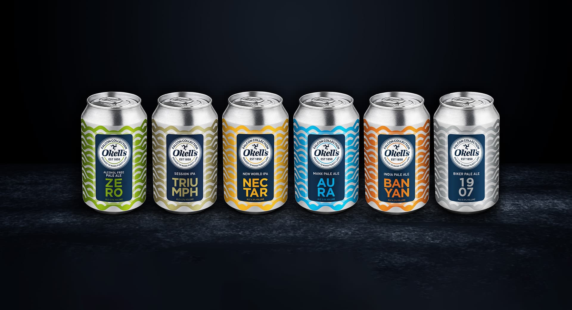
We positioned this range of canned beers as “The Falcon Collection”, named after an early brewery, established by its founder, Dr Okell. The packaging design needed to appeal to a very particular target audience, but it also had to be unique and stand out in a hugely cluttered marketplace. Pack design is all about creating a “lure” to encourage trial because we know once this tribe tastes these products that they will purchase again and again. There is no substitute for a quality product – in the end it is all about the taste.
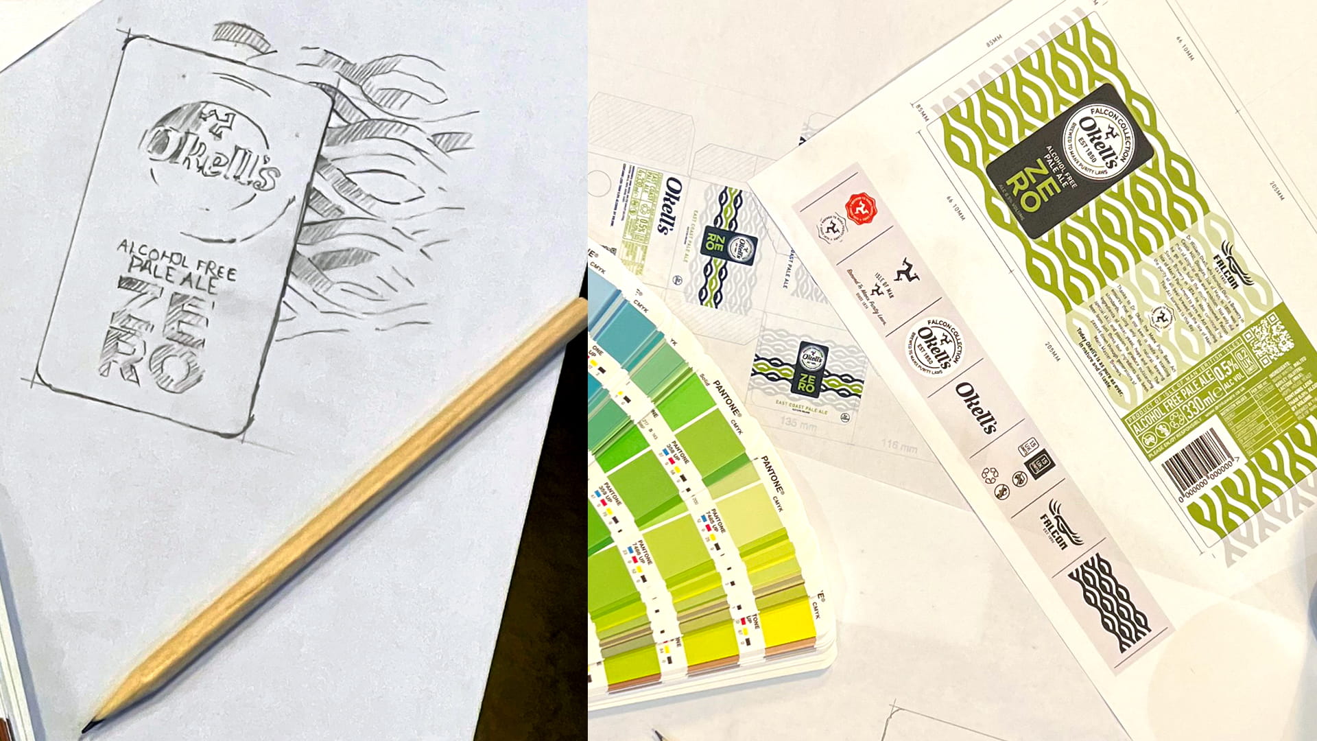
We eventually settled on a “wave” design concept that could be interpreted either as ocean waves to reflect the location of the brewery on a small island, or as contour lines. Either way the wavy lines are visually pleasing and very memorable. We were also involved in helping to develop the product names for each of the products. We created a simple yet highly recognisable brand name panel to catch the eye, both on the single cans and on the 4-pack boxes. A complementary colour palette was created to differentiate the individual styles of beer which ranges from ZERO, the alcohol-free product, to TRIUMPH and 1907 in IPA-style ales.
Our approach to brand positioning
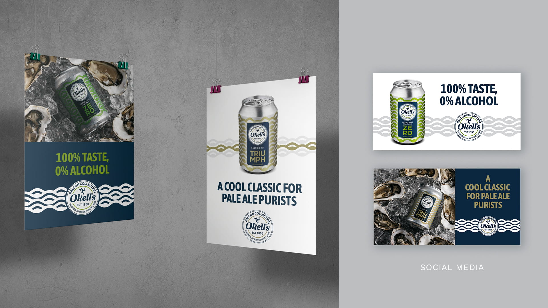
We believe in a “Pack & Brag” visual treatment during the launch phase of a new product in such a cluttered category. This simply means that our advertising must showcase the pack as effectively as possible to enable strong brand recall.
When the client is spending a lot of money to promote and advertise the brand, we need to make sure that the target audience remember the look and name of the product when they stand in front of the shelf in a store. This “P&B” approach is not an excuse to be boring and we used provocative and catchy headlines to convey the brand personality or intrinsic qualities.
One of the most important elements during a launch phase is to equip the client’s sales teams with the tools to help them sell to distributors and retailers. If we fail here, then all the hard work creating a killer brand is for naught. We needed to support the client to complete the circle and make sure they got “liquid-on-lips” with the appropriate audiences.

This also involved creating collateral materials at the point of consumption – in bars, restaurants, events and so on. These items included coasters, beer runners, banners, glassware, umbrellas, and the like.
Outcome
During stage one of the launch phase, selected products were stocked by a number of retailers and sold in bars at summer events where they were very well received. These initial positive results gave the client the confidence to set higher production targets. This also meant that all six products will now be put into full production for the client to roll out the range to the UK, EU and US in the near future.