A gold-standard rebrand for a financial services company
Group Eleven
Brief
This client came to us for help on creating a new brand to help reposition the company in the marketplace. A project as all-encompassing as this falls right in to Ashgrove’s sweet spot as we are geared to deliver detailed and complex projects with many moving parts.
After many brainstorming workshops with their executive team, together we were able to determine the value proposition for the business. After clearly articulating the vision and mission, the client asked us to help engage with their staff and bring them along on the rebranding journey.
Approach
Our first action was to develop a questionnaire to conduct an anonymous staff survey. These insights were very helpful for the executive team, but we also presented the findings to the staff in group sessions to keep them in the loop.
In addition to target audience assessment, the staff survey informed us as we started work on the strategic brand positioning, brand name development, brand logo development and, finally, the creative concept.
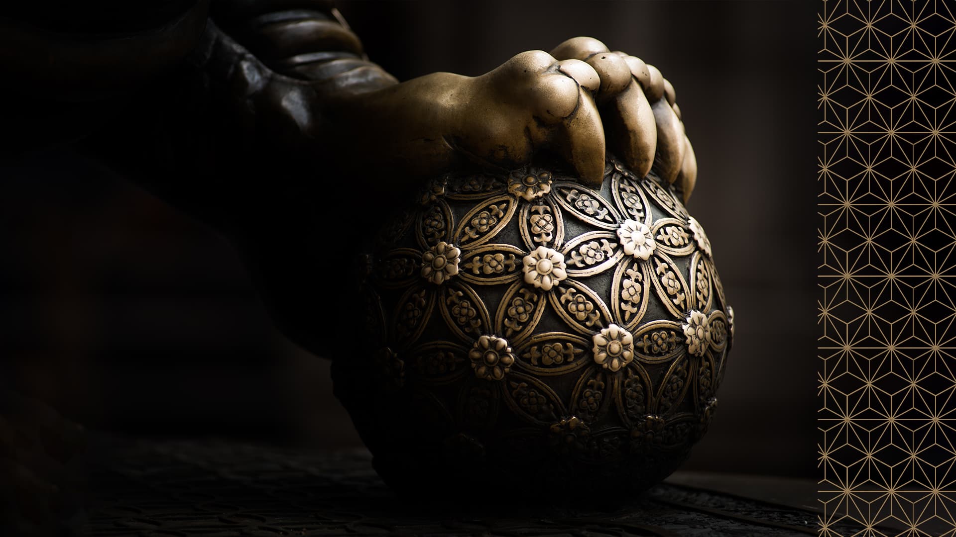
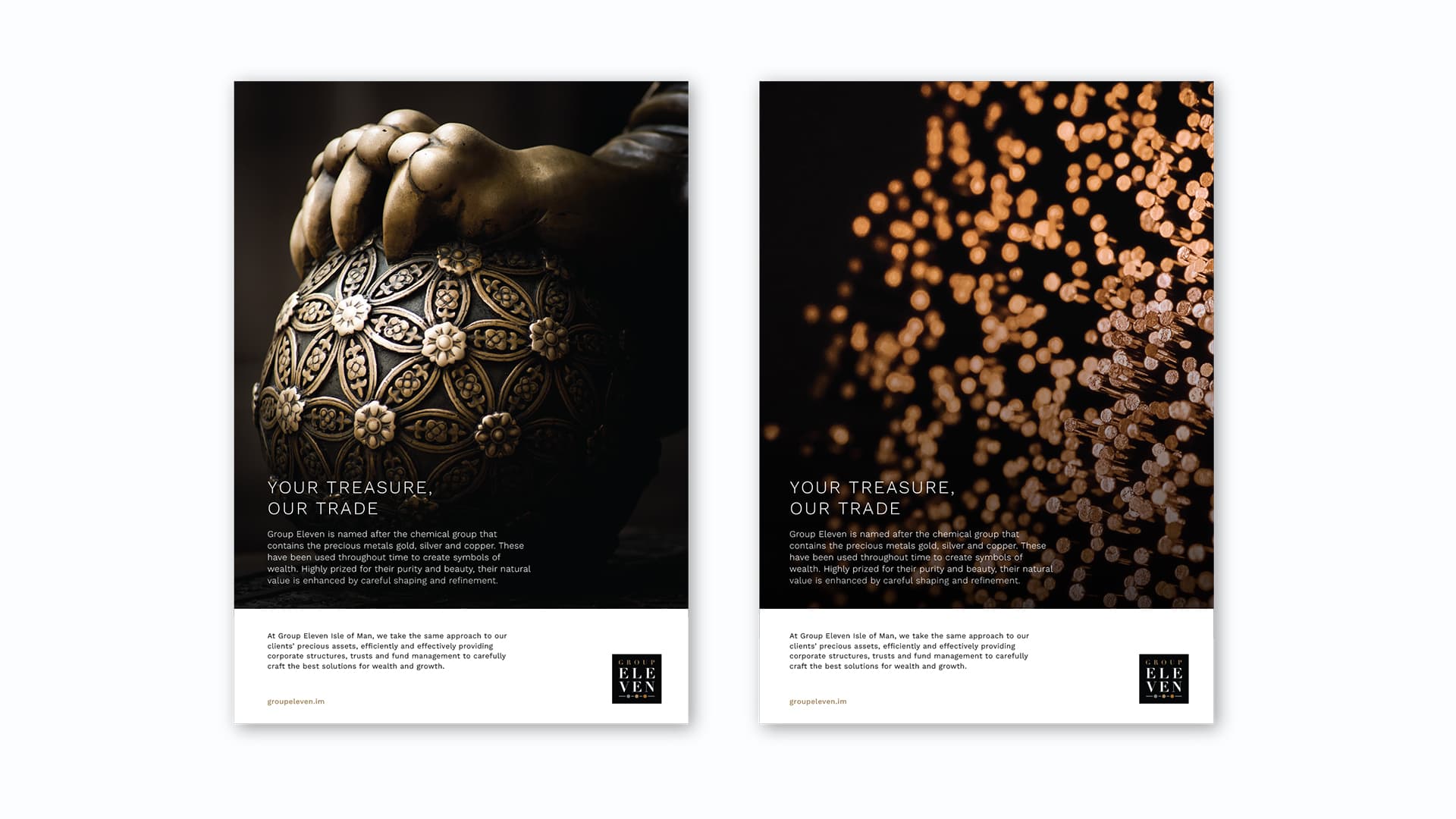
After determining the business key values and USPs we started on the brand name development and again engaged with the staff to keep everyone engaged and allow them to assume ownership of their brand. The final name selected was drawn from the term used to describe the group of chemical elements on the periodic table that relate to copper, silver and gold – also known as the coinage metals due to their long history of use as currency.
As a brand name, Group Eleven also supports themes around teamwork and collaboration and the number suggests a small, close knit and elite community. The link to precious metals provides a natural association with wealth and riches which can be mined for further use in future products and services that will reinforce the focus on excellence and quality.
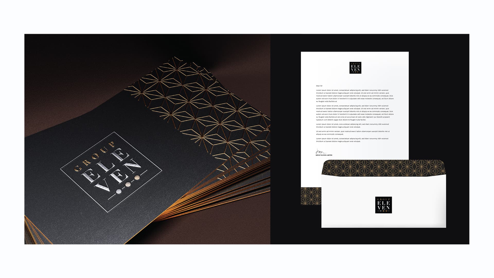
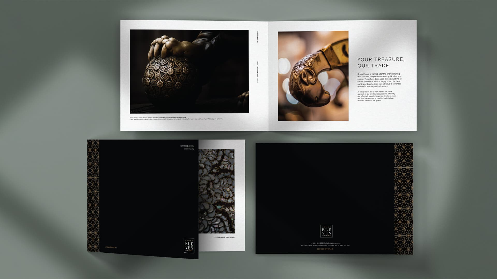
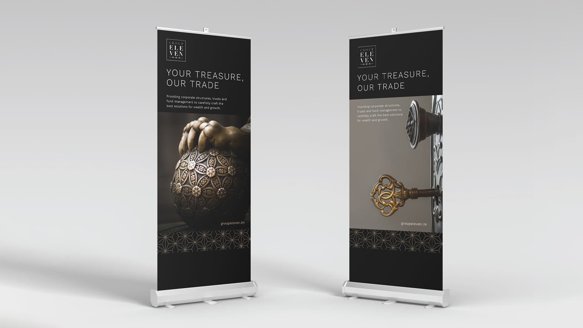
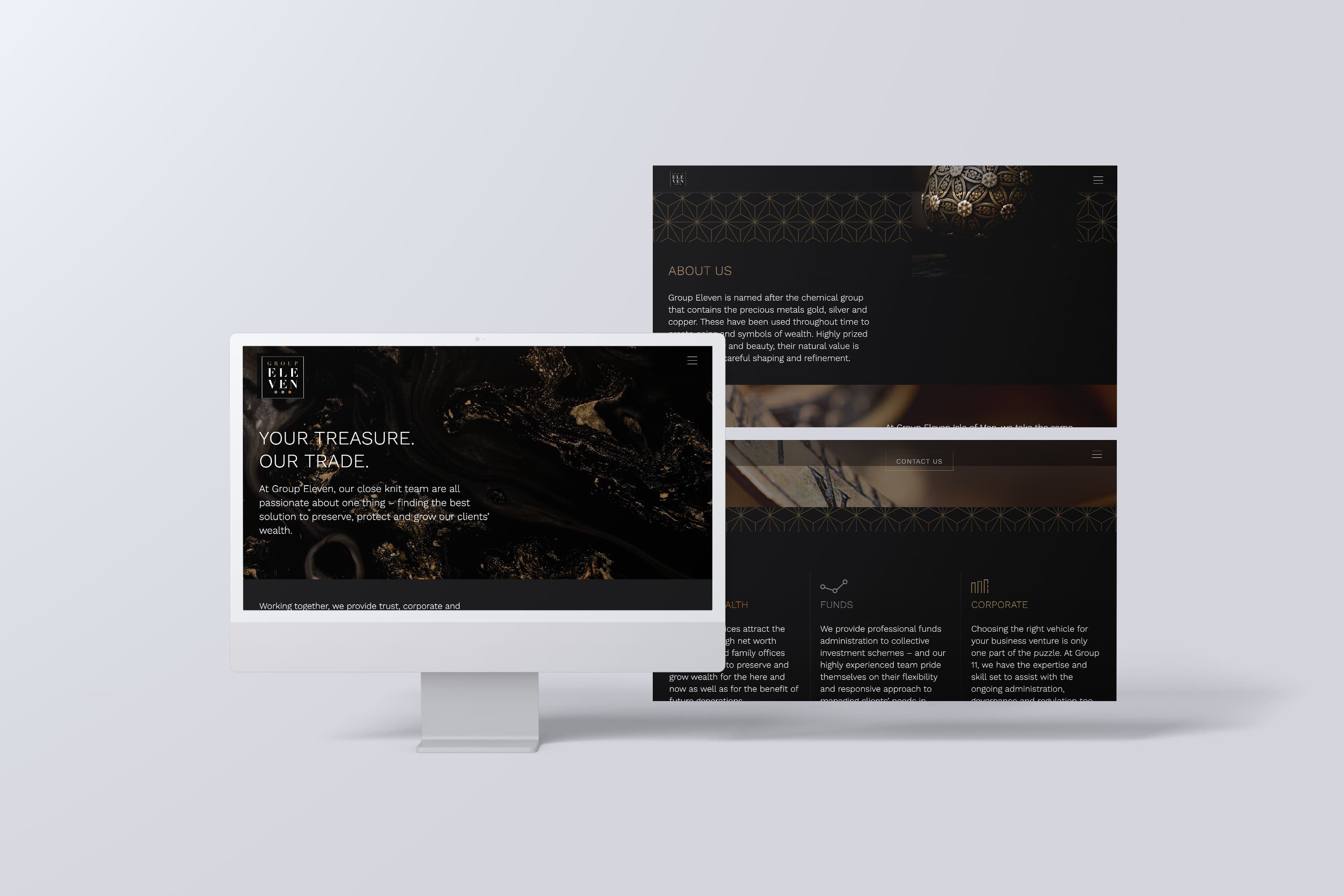
The next stage of development included finding the creative concept and primary message to position the brand. The headline – “Your treasure. Our trade.” – clearly makes the connection between the symbolism of the precious metal and the business’s approach to protecting and growing their clients’ wealth.
This concept was then tailored for each of the communication channels from website, social media campaign assets, collateral materials, including traditional advertising, print and promotional elements, etc.
Finally, we created a very detailed brand style guide for the client to use as their brand “bible” moving forward. This emphasised the importance not only of maintaining visual consistency, put also the tone of voice in how the brand is represented.
The overriding objective when developing these complete 360-degree brand architecture projects is to align all employees to understand why the brand exists – and how brands are built by every interaction a client has with someone in the business.
Outcome
As a recent project, it is still too early to assess the full value of the rebrand (all brands need to be lived in for a while before proper determination can be made) but it has been well-received by staff who, coming from two different businesses, now have a unified proposition to get behind. It has also given the business a strong and powerful identity in what remains a competitive marketplace.